
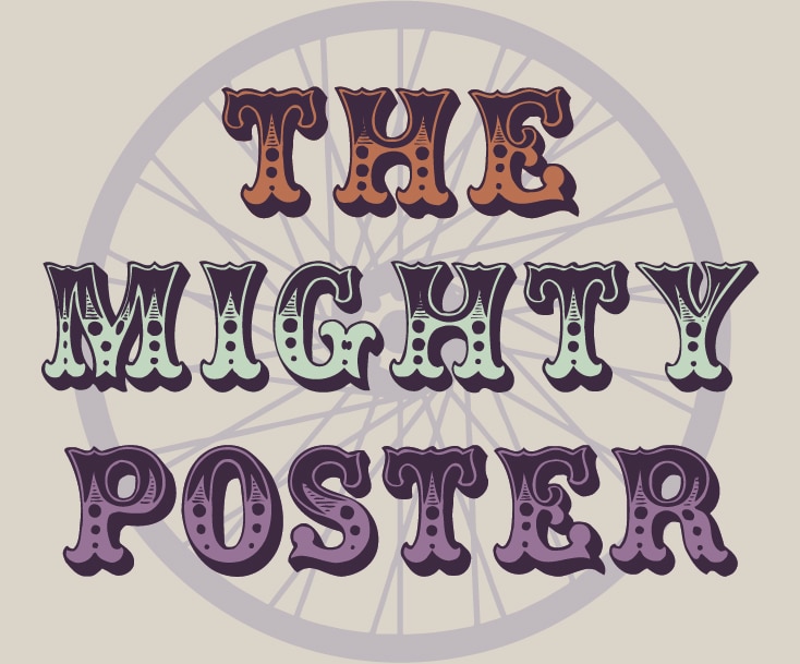
The Mighty Poster for Tour De Nez 2017

Muse is with Tour de Nez again for 2017! And this year, Tour de Nez is celebrating their 25th anniversary. For this special year, our event poster features the legacy of Reno, our biggest little city in the world. In 1992, the Mighty Tour de Nez debuted as an annual street party celebrating a local coffee shop’s anniversary. The wheel of time turns, the coffee shop closes down, but the legacy of good spirited community fun carries on with the Tour de Nez annual bike race. In this year’s poster, we are reminiscing about the old Reno of 1992 as we celebrate the Reno of 2017.
Research, Research, Research
I was born in 1991, meaning, I don’t know anything about how Reno looked in 1992. I had to rummage through the internet for old photos, videos recorded on a tape recorder, and even old RGJ archives for demolition of the Mapes Hotel and Harold’s Casino, and then to find out what new buildings have been built in their place.

The Reno cityscape went through some major changes since 1992, except the Reno Arch, the most significant landmark of the city. For our poster, we wanted to be very clear in showcasing the difference between the old and the new look of the city. Even though it is out of the time range, we included the Reno Arch from 1963 to enhance the different looks of the two Reno cityscapes.
Digital Layout
With several photos, still cuts, and initial sketches, I created my final layout on the computer. By creating it digitally, I could plan out the poster more efficiently and in greater detail. I made my artboard to 11x17in., cut and pasted photos, manipulated the size and the placement of each element, and traced outlines of the building with indications of detail. I printed the final layout so I could easily refer to it and cut it up to trace on my watercolor canvas.

Artist On Canvas
On my watercolor canvas, I traced the basic outline of building shapes from the printout of my layout. Then I went back to fill in smaller details to make each element look complete. Drawing every little detail, like all those tiny windows on the buildings, was very repetitive and tiring, but all that tedious work was 100% worth the outcome. The artwork was inked in with an oil-based drawing pen, and ready for some splashes of watercolor.

Depending on how you mix the colors, how many times you layer the colors and how you use the brush, watercolor can change the mood of the artwork. For this project, I wanted the colors to be eye-catching and vibrant. I brushed on multiple layers of color to saturate the hues and added dark layers to mute some colors for contrast.
Cut and Paste
Once the artwork was colored and fully dried, I cut everything up! Scissors were my best friend and my handy X-Acto knife was a life savior. Now for the fun part of putting everything together! It was like putting together a puzzle, where each individual piece was hand placed to complete the bigger picture. I also had to think about the hierarchy of the pieces. The Reno cityscapes were placed behind the bike wheel so they appeared to be springing out from the wheel. The main Tour de Nez banner was placed on the very top because it is the most important aspect of the piece and needed to stand out.

The Mighty Poster
The artwork is finished, but not the poster. The artwork was photographed and transferred to my computer for the final touches. I edited the photo and cropped it to fit nicely with informative text. With everything approved, voilà! The mighty Tour de Nez 2017 Poster is finished and ready for production!


Making the artwork and finalizing it for print took a lot of effort and time, but it was exciting to see how the poster came together progressively. This project was a fun and creative experience to bring together my passion for design and my love for traditional art. The mighty Tour de Nez is right around the corner, and I hope this poster is bringing in lots of racers and spectators to celebrate the 25th Anniversary!