The Geometrics of Instagram
Trying to stand out on Instagram can be intimidating. There’s so much content, not to mention the insanely creative and talented people creating that content. To use it as a tool to share your brand story takes strategy, but who says that strategy has to be boring? (Spoiler: we don’t say that.)
Let’s focus on one component of an Instagram page: the grid. This is the first thing a user will see when they come to your page, and you know what they say about first impressions? You never get a second chance to make one.
They key is to start by taking a step back and looking at those first 6 to 9 photos as a collective piece of work rather than just individual pieces (though that’s important too, just a whole different ball game). Then the possibilities become endless!
Keep scrolling for 5 grid layouts that will totally revamp your page.
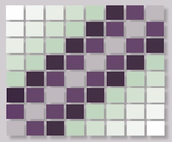
Diagonals – This layout helps your page look instantly organized. If you post a certain color or item often, say photos with greens or photos of your favorite drink/food you can position them in your feed to fit a diagonal layout. Make sure to keep it consistent: all the green photos should land in their own diagonal while the food/drink diagonal is separate.
*Pro-tip: sometimes one diagonal category will stand out better than multiple diagonals!
Tile – This layout will for sure make your page standout! If you’re a lover of quotes or symbols you can show them off by posting them in between your regular posts. Use an alternating pattern to make it look organized and intentional.
Row by row – Row by row is a very aesthetic layout once you become a pro. To follow this theme, choose an item or color scheme to post three photos of at a time. To make sure your grid flows, order complimentary colors together or like items after each other.
Rainbow – This might be the most challenging layout, but it will stand out for sure! Organize your photos into three, following the colors of the rainbow (remember ROYGBIV from school?). You can choose photos where the color is more obvious or photos where the color is slightly obscure but will stand out when it’s in the grid.
Borders – Changing the borders of your Instagram photos will show off your creativity and give your page a unique twist that sets you apart. Smaller square borders, circles, ovals, or rectangles are all shapes you can experiment with!
If this seems intimidating or you’re thinking you might need some help with social media, we have some awesome experts who would love to get creative with you! Shoot us a message here to get started.


